Sparq — Research Operations Platform
Simplifying a fragmented research procurement process by reducing user effort, redistributing work to the right people, and making ownership and next steps obvious.
Overview
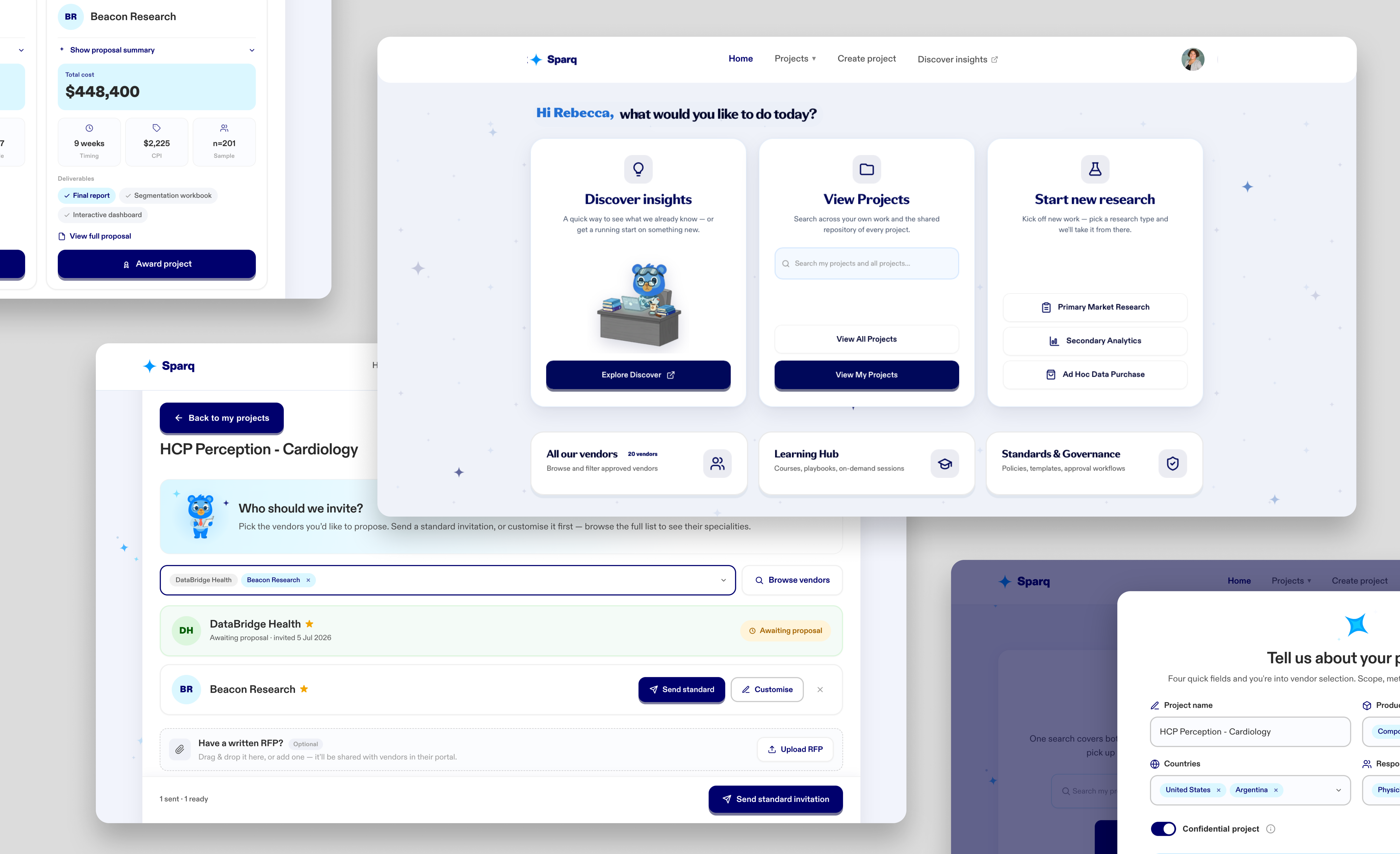
A research operations platform that helps internal teams manage the full lifecycle of a market-research project — from initiation through vendor selection, fielding, synthesis and completion. It centralises research workflows, approved vendors, governance resources, onboarding materials and AI-assisted research capabilities into a single experience.
Instead of stitching work together across emails, spreadsheets, SharePoint sites and manual processes, users can create projects, manage vendors, access research assets and discover existing insights from one place. It matters because a highly governed, fragmented process was creating real administrative drag on people whose actual job is research, not paperwork.
The core challenge was less about screens and more about operations: making a governed, multi-actor process — spanning approvals, vendor management and procurement — feel simple to the end user without stripping out the governance underneath.
The problem
For the business: research project management was spread across multiple systems, documents, email chains and vendor interactions. Users navigated fragmented workflows to create projects, source vendors, manage documentation, request purchase orders and locate previous research — increasing administrative burden and reducing consistency across teams.
For the user: researchers were being asked to complete complex, highly governed processes with almost no guidance. Stakeholder feedback pointed to the same needs — reduce complexity, simplify forms, make project creation feel less administrative, and help people discover existing research before commissioning new studies. A recurring goal: replace large, intimidating forms with a more approachable, onboarding-style experience.
My role & constraints
What I owned — end-to-end UX of the MVP, delivered as functional front-end prototypes with real, working code, not static mocks: the information architecture and navigation model, project-creation flows, vendor selection and procurement journeys, and iterative prototyping. A core part of this was simplifying multi-step processes down to only what was genuinely necessary at each stage, and redistributing effort — for example, shifting steps like vendor uploads and SOW responses onto vendors themselves rather than the researcher, so work sat with whoever was best placed to do it. I also surfaced existing AI-assisted research capabilities more discoverably within the platform, to increase usage and reduce spend on redundant research commissioning.
How I worked across functions — with no formal requirements to start from, I facilitated multiple workshops with end users to understand real pain points, then designed against those insights. I partnered with engineering so decisions stayed aligned with what could ship. Because there was no spec, the process was necessarily iterative — build something testable, put it in front of users, learn, revise.
Process
A genuinely iterative loop at speed — build something real, put it in front of users, learn where the process broke down, revise.
Stakeholder working sessions and conversations with end users to understand current workflows and pain points.
Mapped friction points across project creation, vendor engagement, procurement, onboarding and research discovery, identifying where to reduce cognitive load and cut the number of decisions required from users.
Explored multiple navigation structures and project-setup flows, focused on cutting each process down to only what was genuinely necessary and redistributing effort to the right actor — using the same guided, step-by-step approach common in consumer app onboarding to make a complex enterprise workflow feel approachable.
Built functional front-end prototypes covering the home experience, project creation, vendor selection, research workflows, completed-project management, governance/learning resources, and more discoverable surfacing of existing AI-assisted research capabilities. Began building in Cursor, then moved to Claude Design once its conversational, prompt-driven workflow proved faster for iterating directly on the UI.
Ran iterative stakeholder reviews and working sessions to refine flows and prioritise requirements before engineering implementation, incorporating feedback continuously.
The functional front-end itself served as the reference for implementation rather than a separate static spec. I worked directly with engineering through sprint ceremonies, daily stand-ups, design reviews and user-story clarification.
Key decisions & trade-offs
Project setup originally carried a large number of questions and administrative fields presented all at once. I broke it into smaller, guided steps — one decision at a time — borrowing the same approachable, step-by-step mechanics common in consumer app onboarding. The trade-off was more screens, but it reduced cognitive load and made a heavily governed process feel manageable, which was the core user need.
The decision I'm proudest of. Most enterprise products optimise for the system — asking the user for everything the database wants, upfront. I inverted that: for each piece of information I asked why does the researcher need to enter this, do they even know it yet, is someone else better placed, can the system pre-fill it, or can we capture it later? The result was a workflow where information is collected progressively, auto-populated where possible, and redistributed to the right actor. The trade-off was a more complex multi-actor flow to design, but it moved effort to whoever was best positioned to carry it, and cut duplicate data entry.
A recurring theme in user workshops wasn't visual — it was uncertainty: what happens after I create a project? has the vendor been invited? who owns the next step? I designed the experience around answering those questions continuously — clear status, ownership and next-step guidance, progress indicators and success states. The trade-off was extra work to define and maintain every state, but it replaced process ambiguity with predictability, exactly the confidence stakeholders wanted.
Outcome & impact
This platform is early in delivery, so outcomes are framed around what was designed, built and validated rather than post-launch business metrics.
“Enterprise users don't want fewer capabilities — they want the effort organised intelligently: collected progressively, redistributed to the right actor, and wrapped in clear ownership and next steps. None of that would have been discoverable in a normal timeline. Being able to move from insight to a working front-end in days — not weeks — was what let us actually test that idea against real usage, again and again, until it held up.”