Decidr — Decision Intelligence Platform
Turning fragmented commercial data into confident, agentic-AI decisions — one conversation at a time.
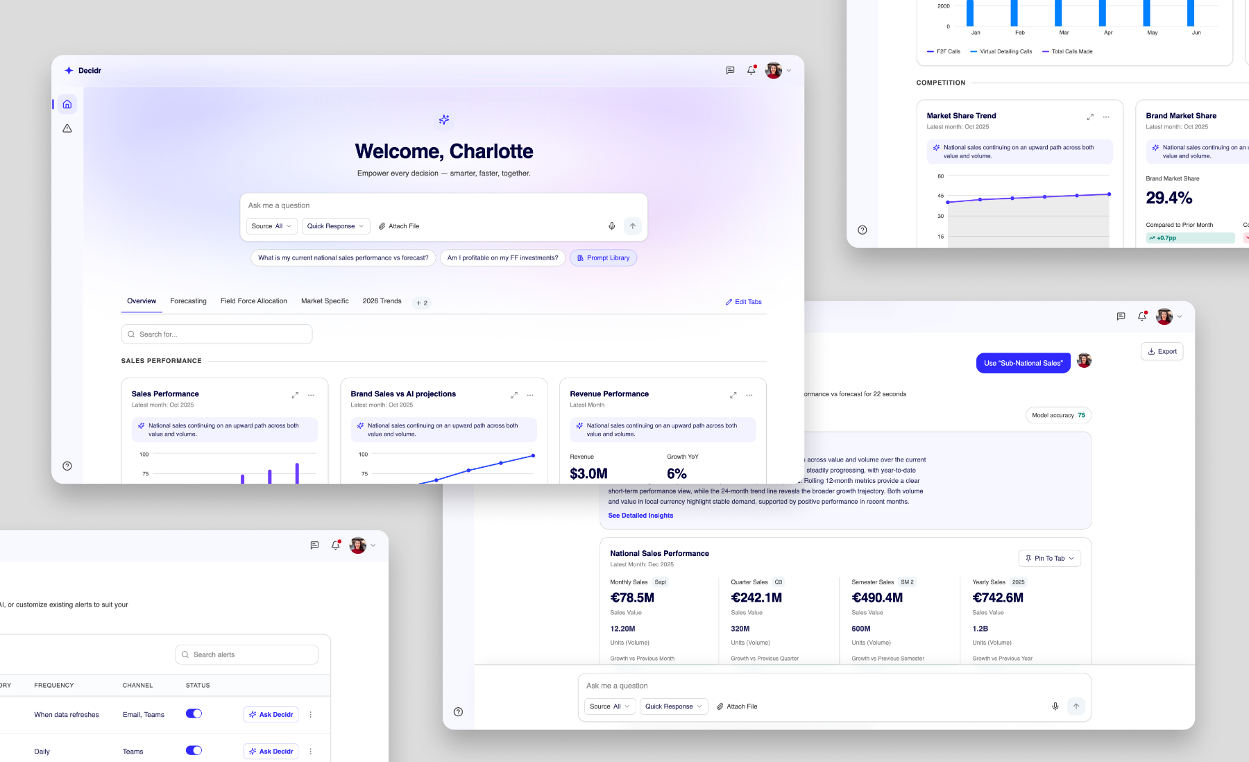
Overview
An agentic AI decision-intelligence platform built for a global enterprise's commercial teams — brand leads, country presidents, therapy-area leads and analytics functions. Instead of switching between dashboards, users ask questions in natural language and get unified, explainable insights across performance, forecasting, ROI, targeting, segmentation and competitive intelligence.
It mattered because leadership had committed to a step-change in how commercial decisions get made — moving from lagging, manual analysis to predictive, prescriptive, simulation-driven agility. My job was to make an ambitious agentic system feel trustworthy and usable enough that senior business users would actually act on its outputs.
Product name and screens are whitelabeled for confidentiality.
The problem
For the business: decisions were slowed by fragmented tools, inconsistent KPI definitions across HQ, regions and field, and heavy reliance on PowerPoint and Excel to stitch a story together. Lagging indicators meant early signals were missed and opportunities left on the table.
For the user: discovery research surfaced one consistent pain — bouncing between multiple reports with delayed, manual insight-to-action. Five interviews across three personas pointed to the same friction: disconnected tools, invisible subnational data, one-size-fits-all views, and no trust signals on AI outputs. I structured the design around three productised personas (Brand, Country, Above-Country), segmented by scope of decision-making responsibility rather than job title.
“Too much data, not enough insight. I want to know the ‘why,’ not just the ‘what.’”— Discovery interview, commercial lead
My role & constraints
What I owned — end-to-end UX from 0 through MVP and into UAT (ongoing): the dashboard, chat/agent output, prompt enhancer, view-reasoning, sources, confidence score, deep dive, onboarding questionnaire, alerts management, workspaces and settings. I facilitated usability testing sprint by sprint, directed the agency pod's daily output, signed off screens before dev hand-off, and ran POC exploration for high-risk areas.
How I worked across functions — I co-led a two-day design-thinking workshop with business stakeholders, ran weekly UX planning and Figma handoff with engineering to validate agentic behaviours, and ran usability testing across sprints with brand-country, analytics, omnichannel and field-effectiveness personas.
Process
Research through handoff — with AI used to put testable things in front of people early, not as a synthesis shortcut.
5 semi-structured discovery interviews across the three personas; transcripts synthesised with Claude and internal LLM tooling to cluster pain points, sentiment and unmet needs.
Two-day design-thinking workshop: current-state journeys, How-Might-We framing, use-case templates, future-state journeys, MVP prioritisation and brand identity. Workshop outputs were also synthesised with Claude to sharpen themes before moving into design.
Built a functional front-end POC in VS Code based on workshop insights — before any official design screens existed — to validate direction with the client, sense-check the concept, and drive requirements-gathering and user-story conversations.
Design executed by the agency pod, with me overseeing direction and quality. In parallel, I ran feasibility conversations with engineering and supported the agency with rapid concepts (VS Code / Figma Make) to explore direction and pressure-test requirements ahead of their Figma work.
Regular interviews and usability testing with end users throughout the design sprints (not just periodic checkpoints), with findings fed back into the agency's work each sprint.
Dedicated design-dev handoff in Figma, sprint reviews with business and dev for approval, then dev pickup — followed by reviewing dev implementation against designs to confirm visual and interaction fidelity.
Key decisions & trade-offs
Workspaces was the most complex feature on the roadmap and static mocks weren't surfacing the hard questions. I built a functional front-end POC in Figma Make, referencing the existing Figma designs so it would be directly usable if we moved forward, so business could feel the switch pattern and catch-up feed while dev pressure-tested feasibility against the same artefact. The result: workspaces was deferred on feasibility grounds — reached in days rather than after producing full screens. But it wasn't wasted effort: the POC helped define the requirements we'd need when we circled back to workspaces later, so it went into the backlog scoped and ready rather than shelved with nothing to show for it. The trade-off was a few days of exploration up front; the win was avoiding sunk design effort on something that couldn't ship yet, while still landing on solid requirements for next time.
Manually setting up alerts meant users working through a large number of inputs per KPI card — a heavy lift just to get baseline monitoring in place. I proposed having the agent suggest alert settings automatically, based on what it already knew about the user and the conversation context, so a sensible alert was set by default with no manual configuration required. Users could still review and adjust anything they didn't agree with, but the starting point was AI-suggested rather than user-built from scratch. The trade-off was more design work to define good defaults and make the suggested/adjustable states clear, but it removed a genuinely heavy manual task and kept the interaction consistent with the platform's core pattern: agent proposes, user confirms.
The hardest UX problem wasn't showing insights — it was making senior users comfortable acting on AI outputs. I designed trust into the output itself: every answer carried traceable sources with links back to the underlying data, an expandable "view reasoning" trail, and a confidence score. The trade-off was visual and interaction complexity on every output — but usability testing confirmed these signals were the specific reason business users were willing to move from looking at the intelligence to acting on it.
Outcome & impact
“If I did it again, I'd push harder for aligned problem framing before design work started — some rework came from ambiguous scope handed to us before the key business questions were settled. I'd also lean on rapid AI-built POCs earlier and more deliberately: the workspaces POC proved that a few days of functional prototyping could resolve a debate static mocks couldn't, and I'd want that as a first move on ambiguous features, not a fallback. The biggest lesson from this project: for agentic AI products, trust is a UX feature, not a technical afterthought — sources, reasoning and confidence weren't nice-to-haves, they were what actually let senior users move from watching the intelligence to acting on it.”